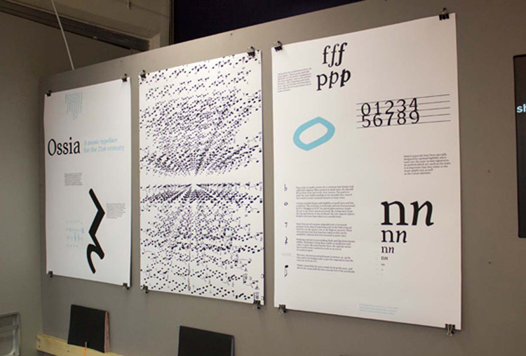
Ossia Music Typeface
This work, completed for my degree in Visual Communications, is concerned with the visual representation of music.
I am attempting to improve communication between composers, performers and listeners, both on a practical level (legibility, readability, etc.) and a connotative level (how can a composer better convey the deeper meanings of their music).
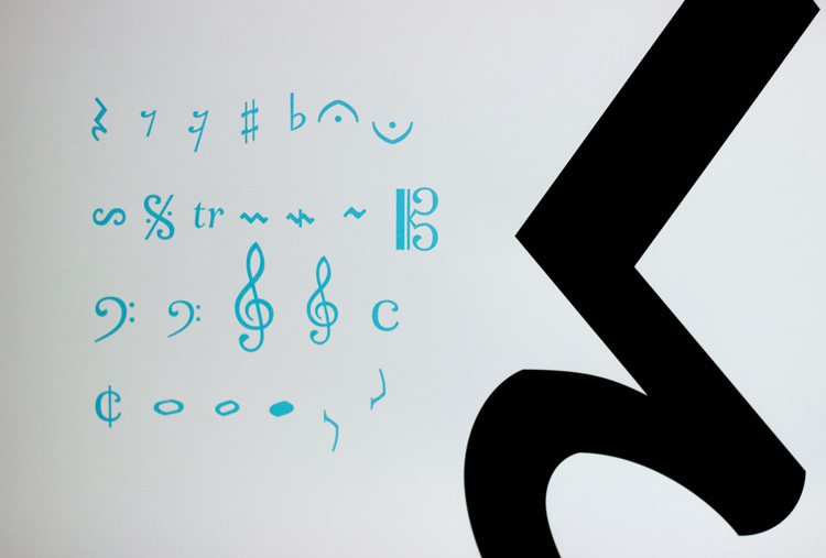
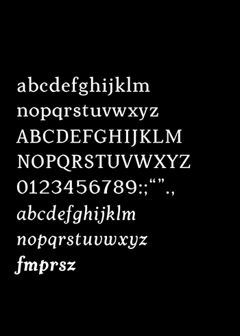
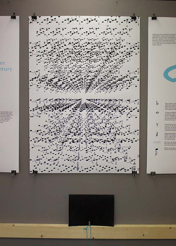
Music notation is a language and a typographic system. Music notation occupies an interesting middle ground between the image and the written word. I set myself the task of developing a clearer and more accurate communication from composer/author to performer/reader. This resulted in a new music typeface, Ossia.
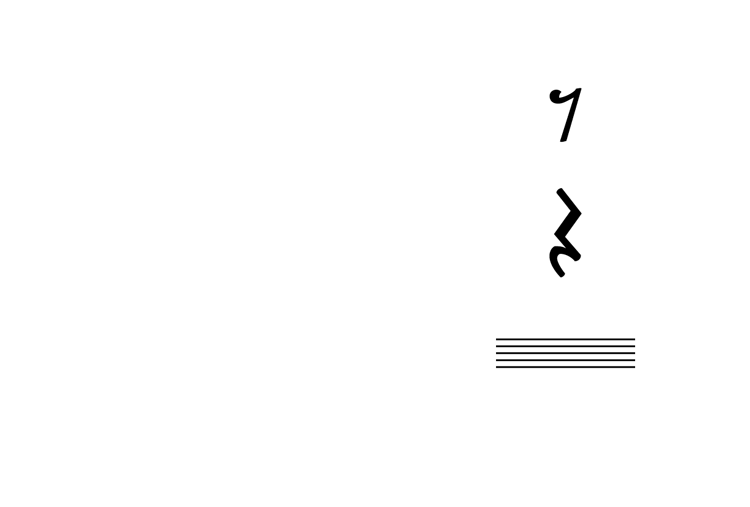
Some features of notation originally had a functional purpose in the days of engraving such as the ball terminal seen here on the quaver rest or the flags on quavers. These elements have lost that function today so they can be reduced and even removed in some cases.
Reducing contrast means making thick and thin lines similar widths. This helps to keep them visible at small sizes and easier to print. By removing fine lines, the typeface works just as well at low resolutions such as on screen or in photocopies.
The stave, the horizontal grid music is written on, can be thin and in the background, to give the impression that the notes are in front of it.
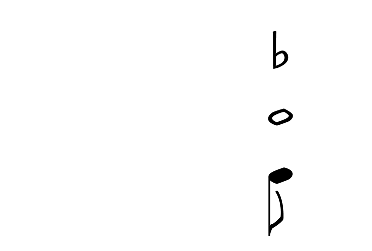
These holes at inside corners are a common type design trick called ink trapping. When printed at small sizes, the ink will fill up these areas and create clear corners. The goal is to make the most legible symbols at the intended size, even if this results in some unusual features at larger sizes.
Cutting rounded shapes aids legibility at small sizes and low resolution. This is known as m-formula and was first proposed by W.A. Dwiggins in 1937. An optical phenomenon causes the eye to see these corners as round. By cutting away from the top and bottom of the notehead, the note appears lighter between the stave lines where it is usually heavy.
Thicker stems help the notes stand out from the stave, and also tie the stems with the low contrast feel of the noteheads.